The process
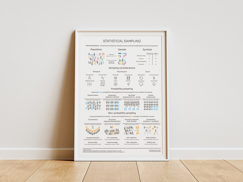
This is agruably as important as sampling, but we always have these dry definitions we use to explain the main types of data in statistics. My students are always beyond ecstatic when introduced to this topic.
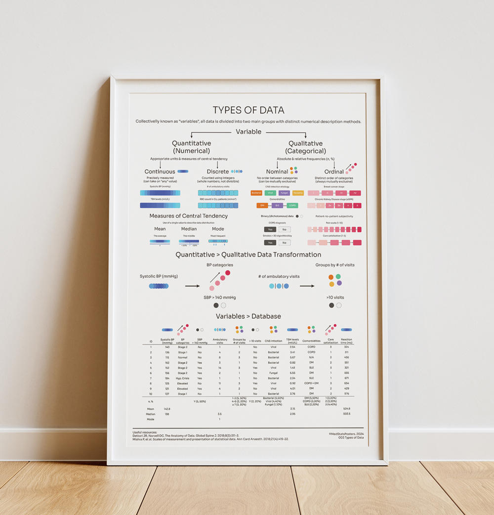
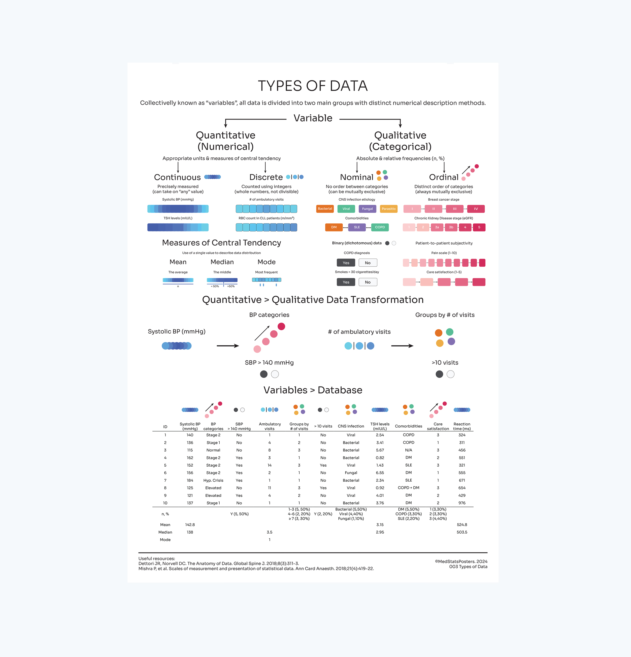
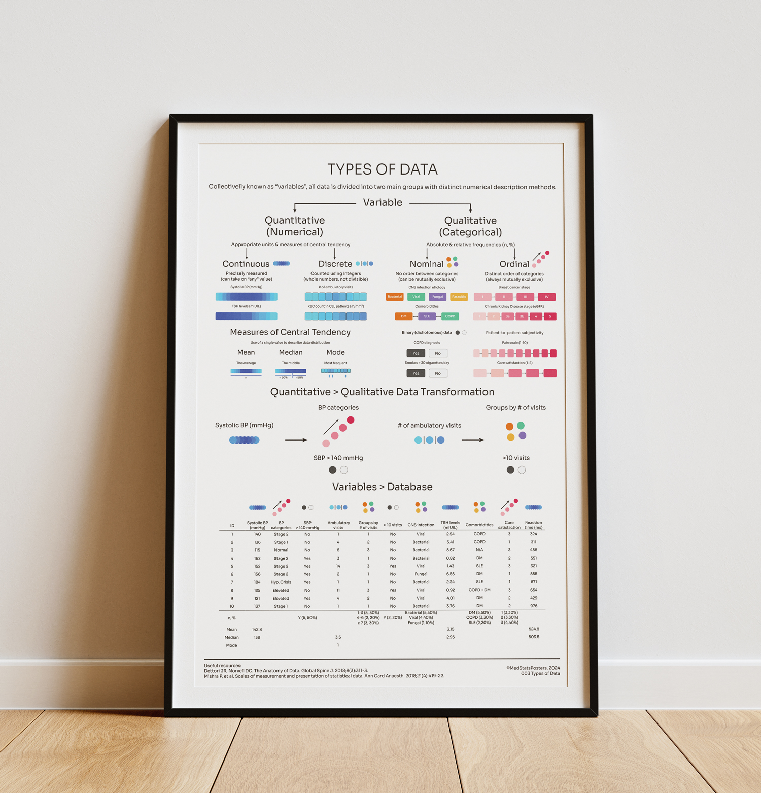
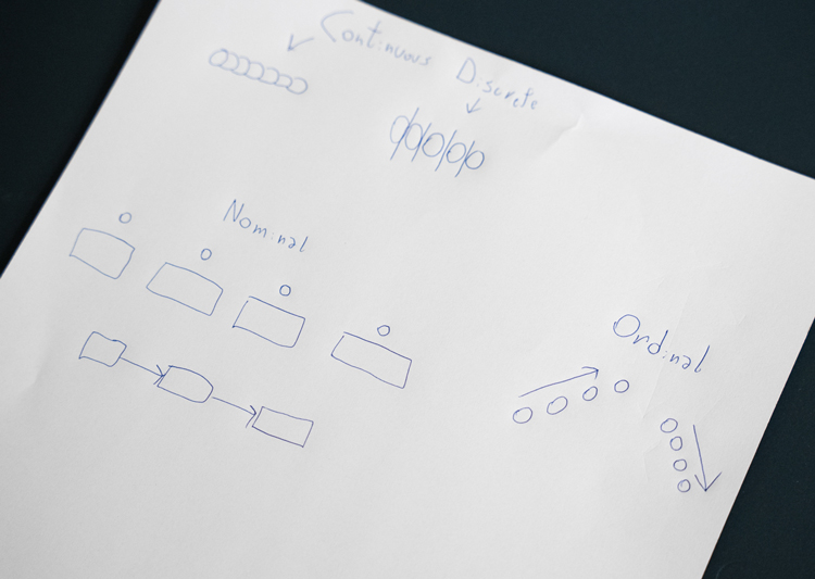
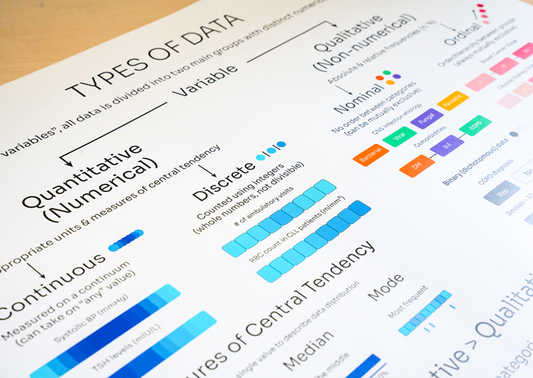
Differentiated into qualitative and quantitative, data is futher divided into norminal and ordinal/continuous and discrete, respectively. But the trick is not just knowing the types of data, but how are they described.
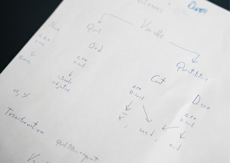
Though I made several corrections along the way, It didn't take much to find the right content setup. I had a pretty good idea on how to present a clear distinction, and I went straight into it.
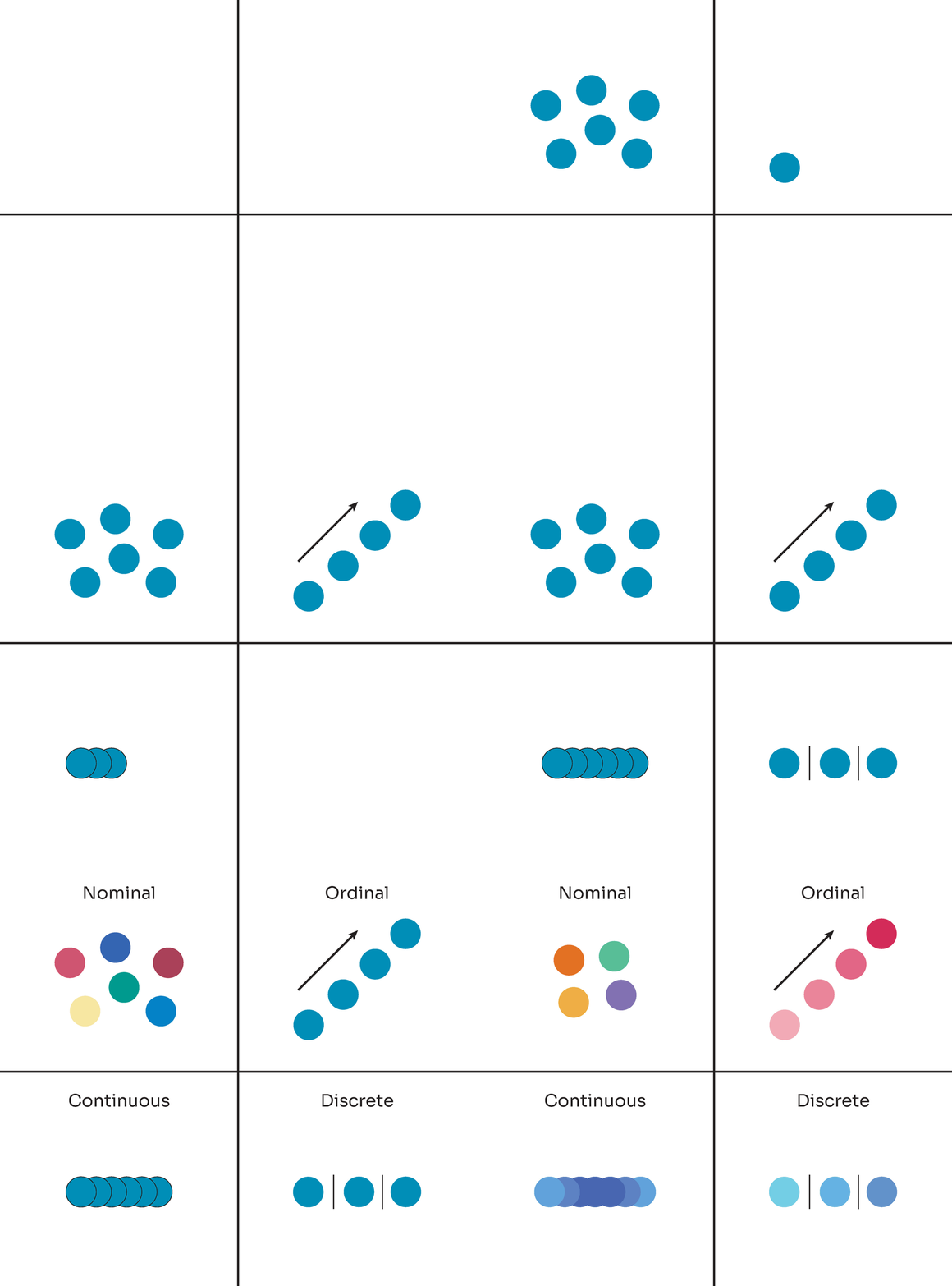
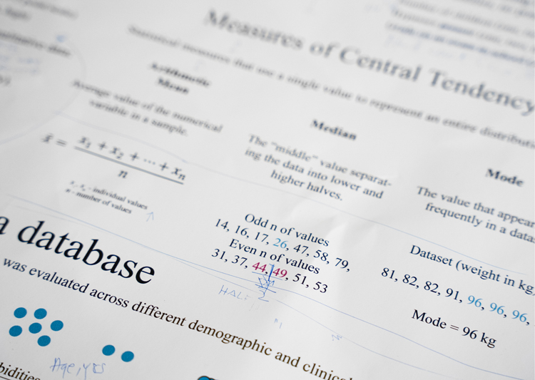
The challenge was to use as little text and as much imagery as possible to present the different types of data. The same applied for mechanisms of describing the data- frequencies and the means of central tendency.
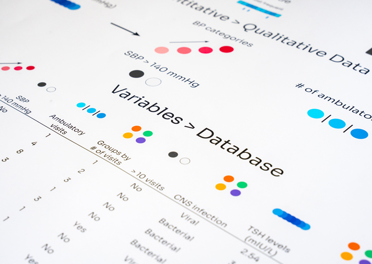
Data transformation, often overlooked when collecting information, is important to understand at this stage. To know the sequence of transformation is to relieve yourself of hidden traps during data analysis.
Different colours and font sizes were tested before standardizing the text ratios/colour palettes, especially for continuous data. The use of gradients were quite appropriate for ordinal and both types of continuous data.
Unlike the sampling poster, types of data was initially quite heavy with text. I spent a lot of time moving content around before I was able to transform it into images.
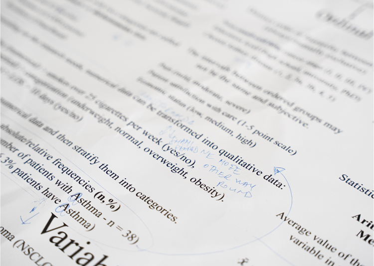
I was again testing paper thickness, text size and how equations looked on posters. Feedback from my undergraduate students was critical - they hated seeing so much text! And they were absolutely right.
Through several iterations, I understood that a better color-image sync was needed, while being a simple and straightforward interaction. Eventually, our iterative testing led to a version that I was happy with.
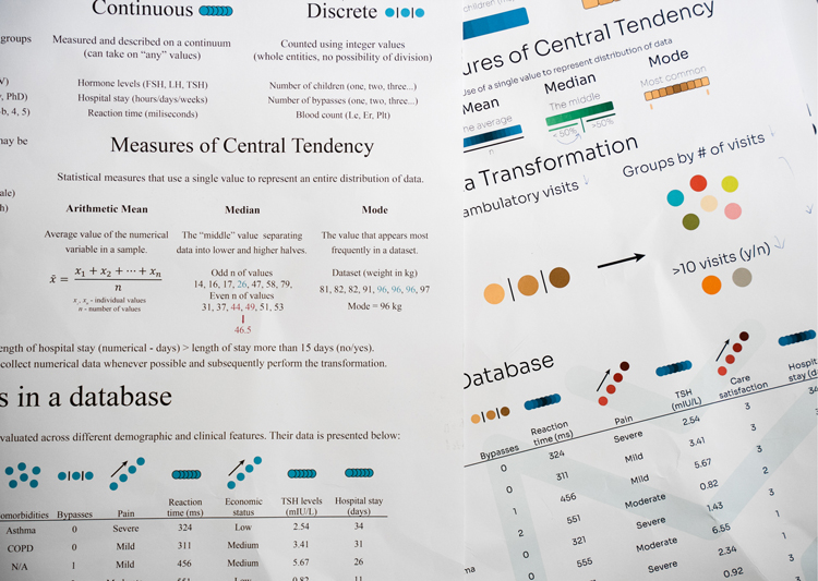
I am very proud of how this poster turned out. The four types of data are clearly described using concise examples. "Types of Data" introduces color patterns that you will now start seeing in subsequent posters.
Data transformation needs attention, which is why it is so "big" on the poster. We have to understand that only quantitative data can be turned into qualitative - not the other way around.
It is always practical to follow theory with an example. So, to help you with day-to-day data entry, a database with different variables is at the bottom third of the poster with appropriate numerical descriptions.
