The process
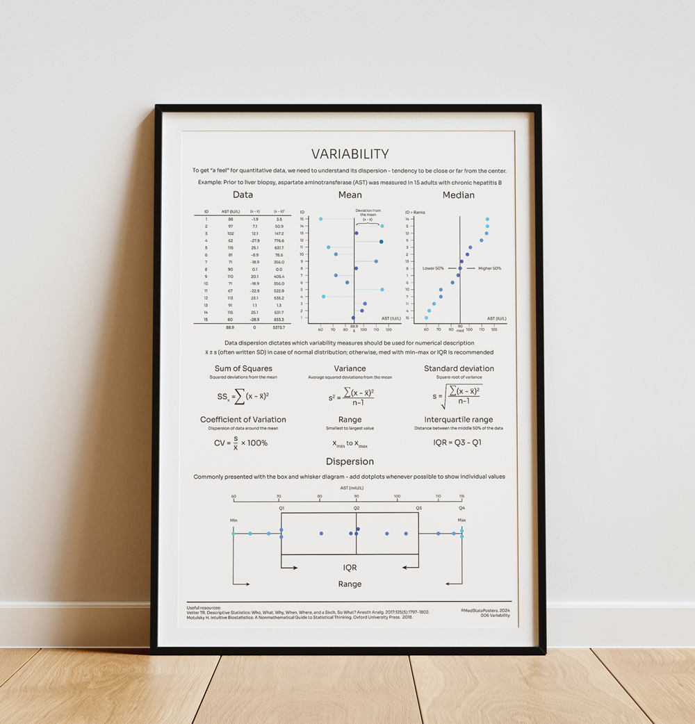
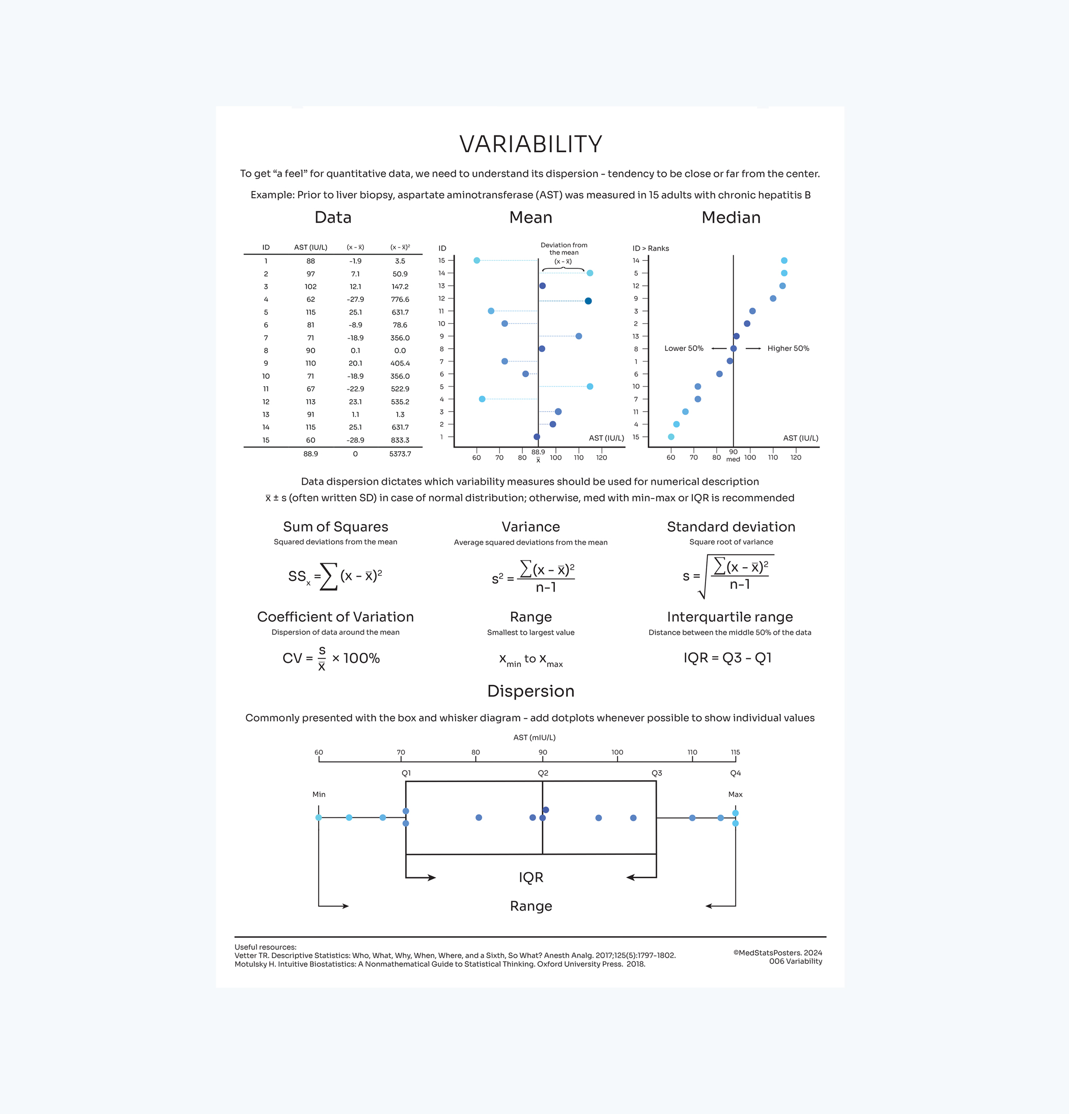
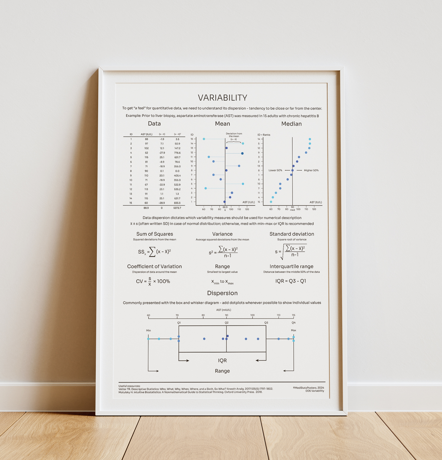
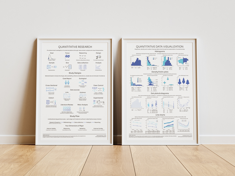
The first poster that dives into one of the more important theories of statistics. Variability is critical to understand for observing quantitative data. Hence, I made it right after quantitative research.
As with most statistical concepts, visual representation is always superior to textual. This topic is something we teach our students at the beginning of their course, so I had a good idea how would I do it.
But along with variability come a number of new terms that are introduced for the first time, as well as new equations. Allocating the right amount of space was, therefore, the main challenge.

Let's be honest - one of the reasons we went into medschool is to not do math. So when I start describing variability and use just a little bit of math, students get a visceral reaction (I certainly did).
But we somehow manage to pull through it when we draw it on the board. The key hurdle is to understand variance, standard deviation, and coefficient of variation - they tell us about the "disperson" of data.
Dispersion is easy to see when sketched out - so the approach to this poster was straightforward. The box and whisker plot, often used as the tool for graphical display of the dispersion, had to be included.
Again, I had to remember the feedback - reduce text and increase imagery. The use of blue color means the concept is tied to quantitative data, refering to the "types of data" poster.
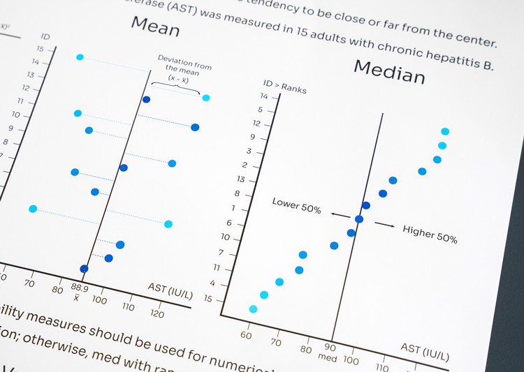
The use of gradients have again turned out to be helpful when explaining distributions and variability of data. The relationship between color intensity and density is easy to associate.
The equations, though, are different story. After trying out multiple iterations, standardizing through use of our main font, Sora, helped this section of the poster look clean and not too technical.
How does this poster help you? It explains what variability is, both visually and mathematically, while sequentially showing how are the measures of variability generated.
Most importantly, it reminds you of the need to see your data. In addition to visualization, knowing how measures of dispersion are derived is crucial for both basic and advanced statistical testing.
Simply put, measures of dispersion will dictate your approach to analysis. So, if you understand variability, you will understand how will the data behave when subverted to testing.
