The process
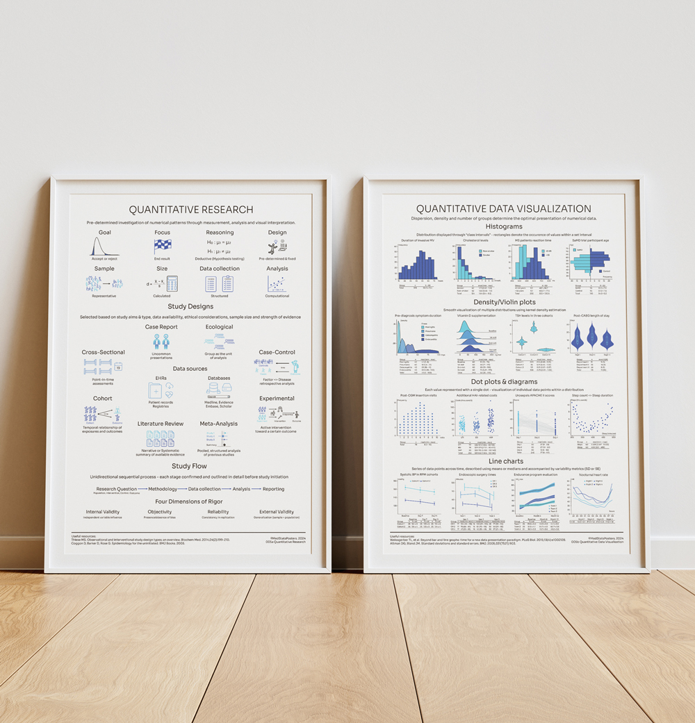
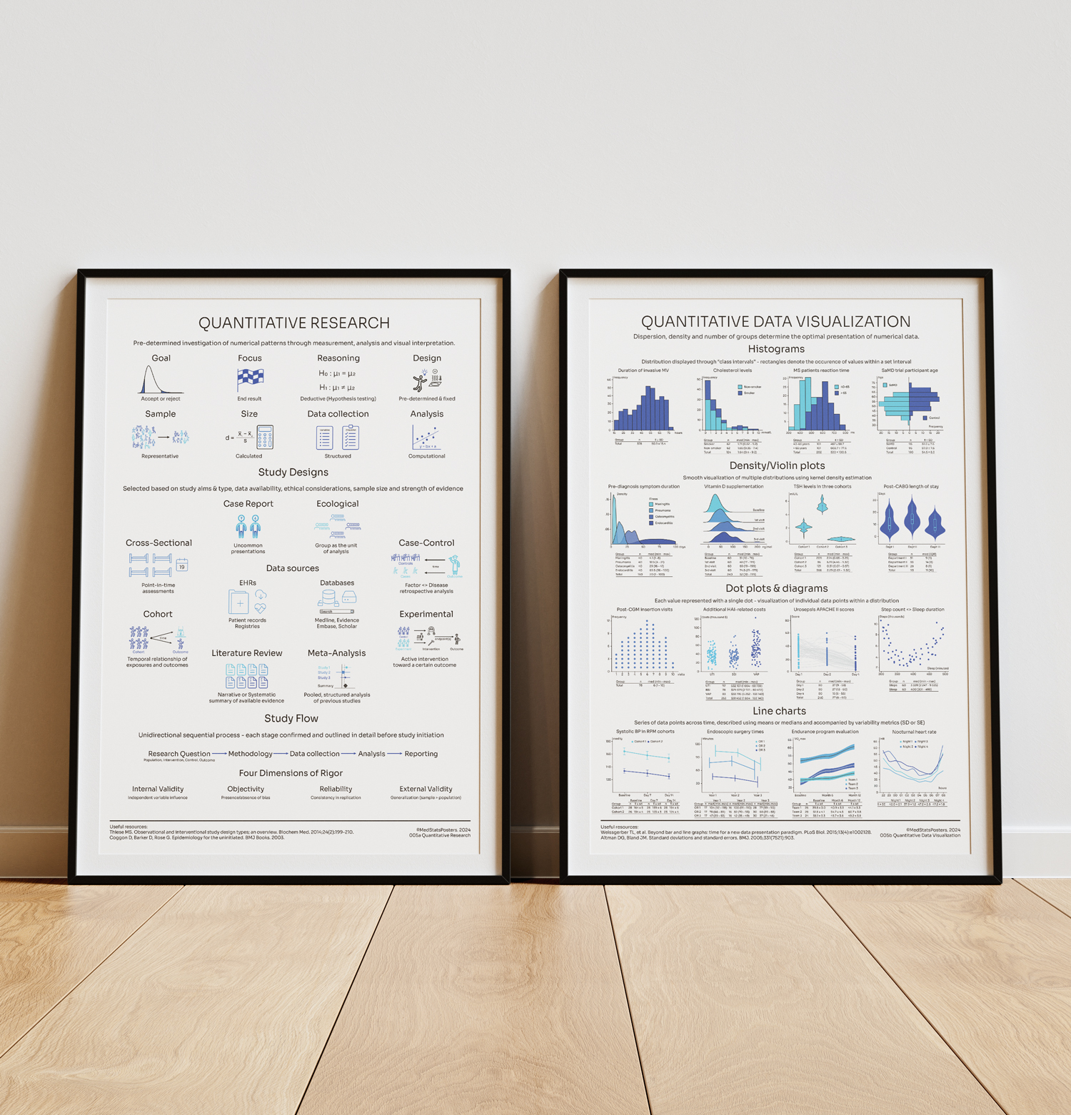
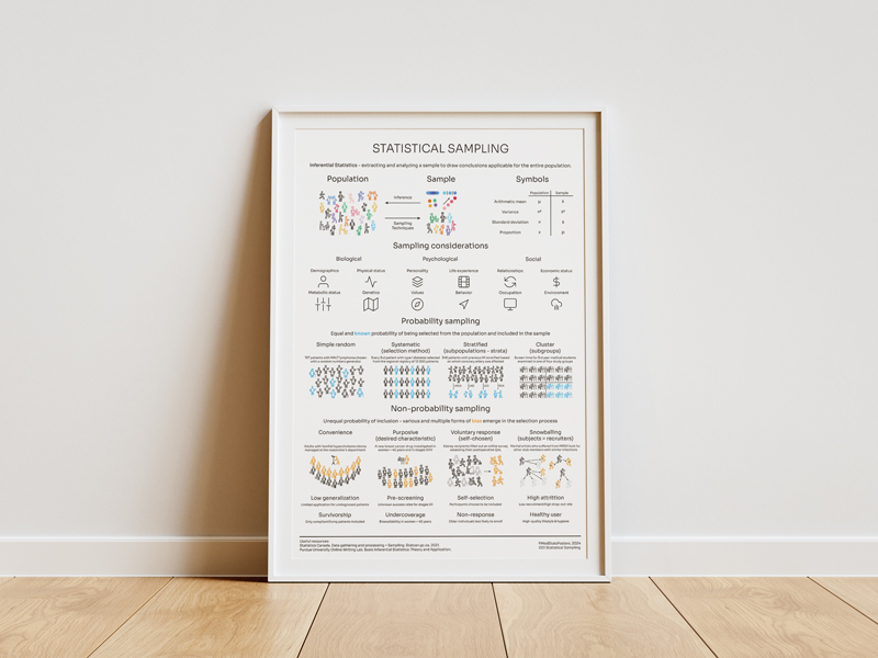
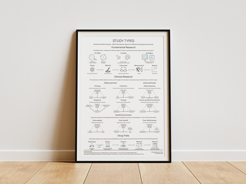
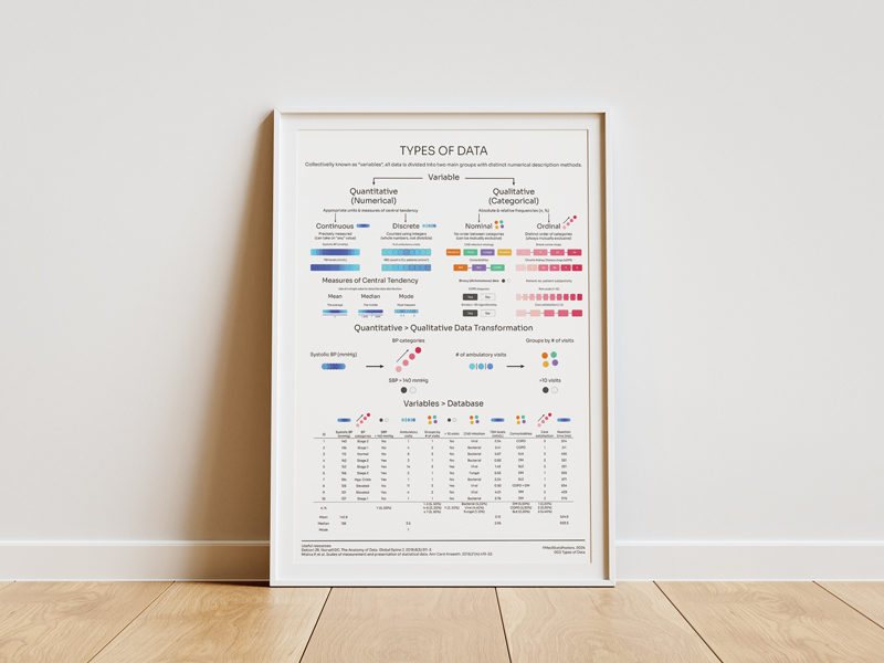
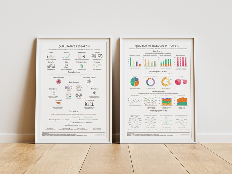
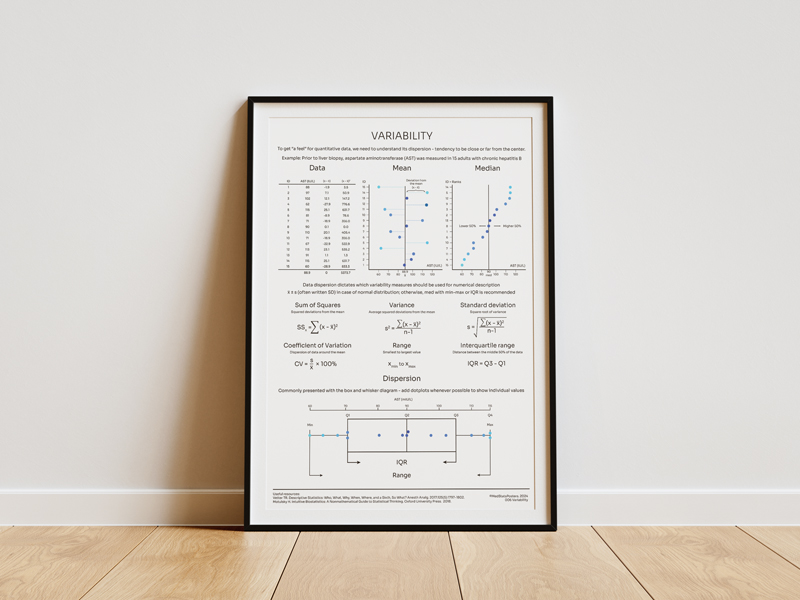
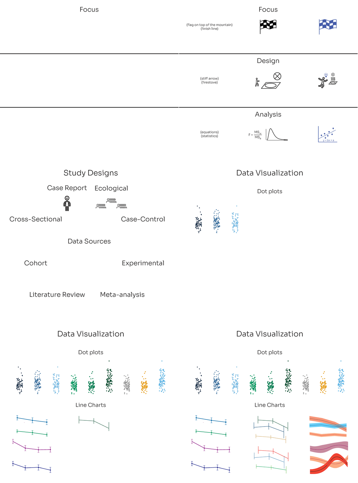
Quantitative research is, in many ways, the polar opposite of qualitative research. But because the same principles apply, there was an equal need for two posters to tell the whole story.
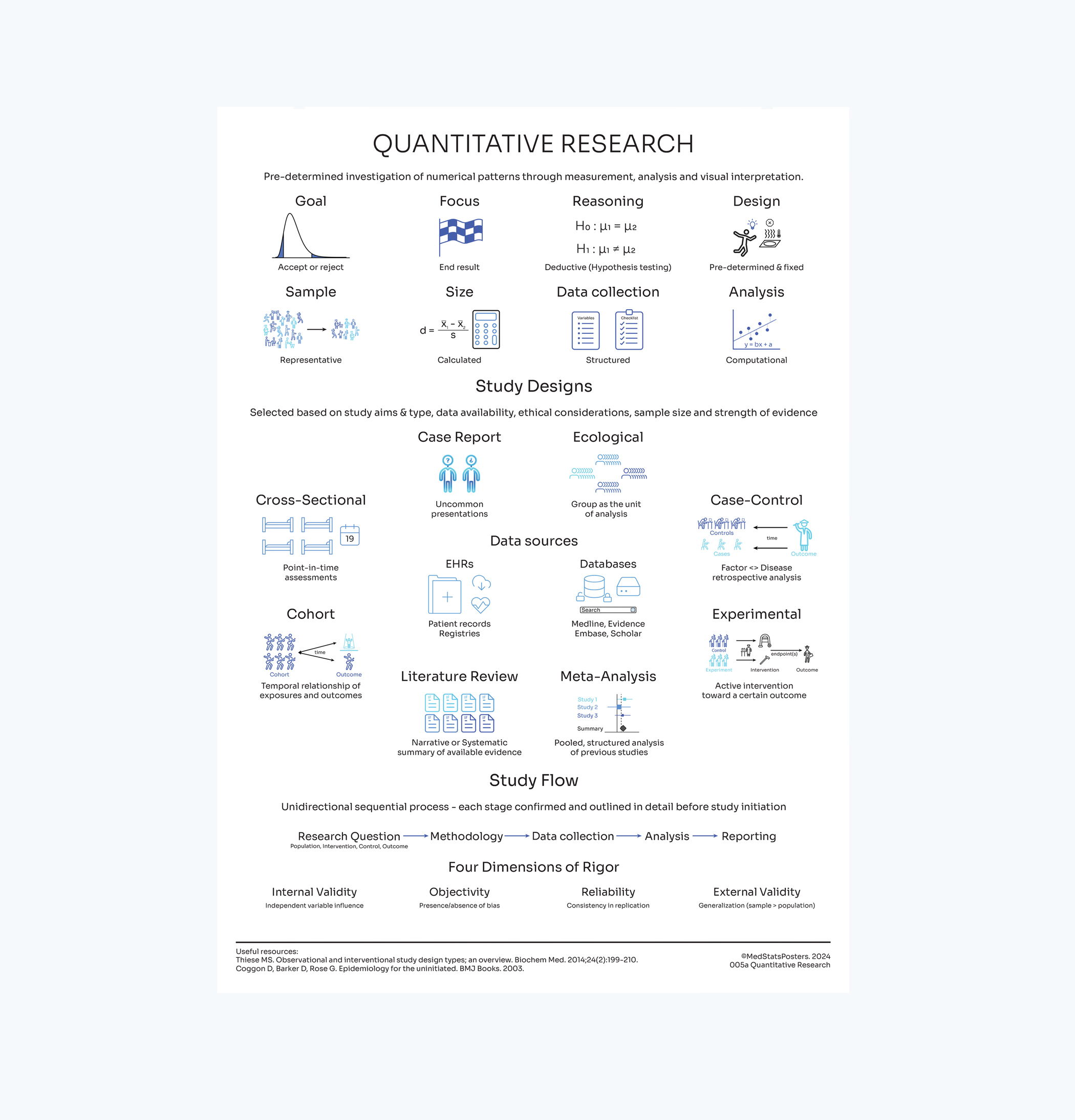
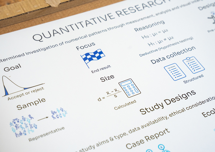
In quantitative research, the focus is on the outcome and the data - the aggregation of information and utilization of statistical tools to analyze it for the purpose of making conclusions.
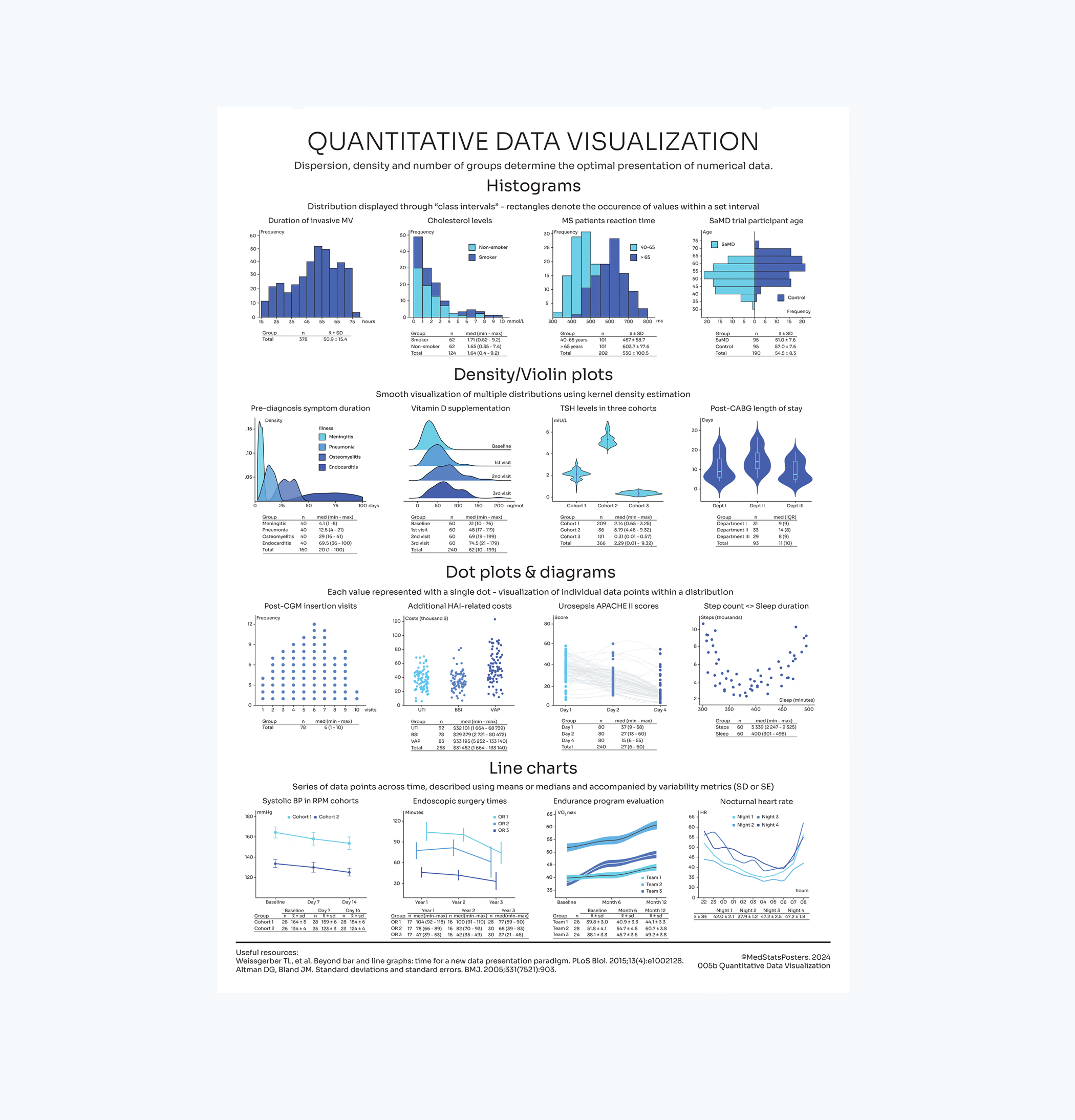
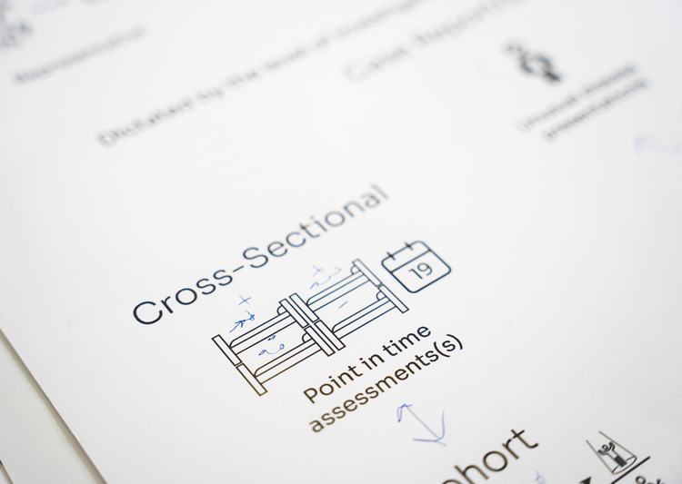
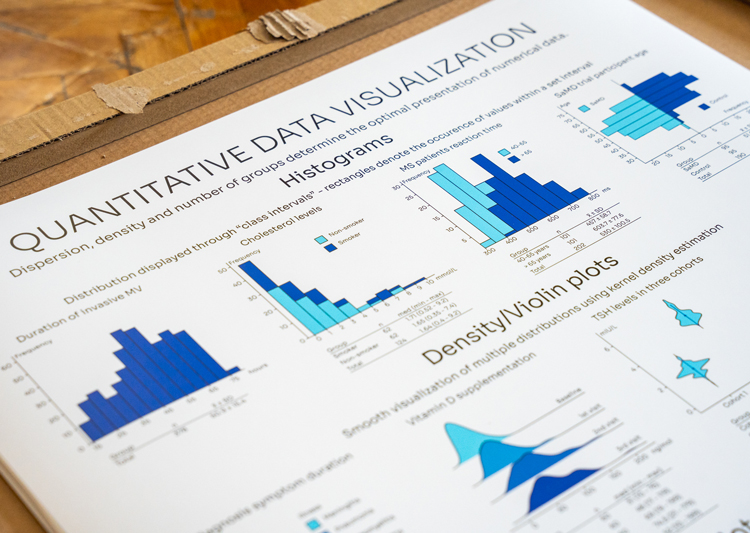
The first poster covers the "why" and the study designs you're familiar with, while the second shows how we should visualuze the data - before we decide what to further do with it.
Unlike its counterpart, quantitative research is something we encounter every day as we scour the literature. But spent a lot of time understanding how to present this topic so that it is repeatedly useful for you.
Though quantitative research can be exploratory, it primarily serves to test a pre-determined hypothesis. Also, designing the study, as well as its execution, follows a strict and rigid process once initiated.
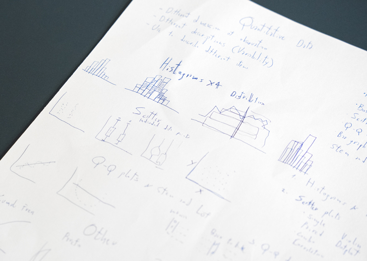
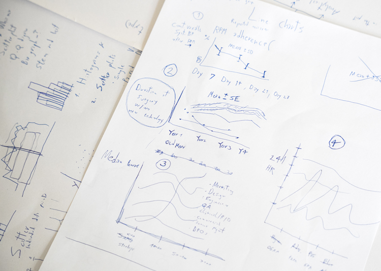
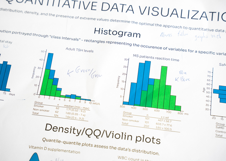
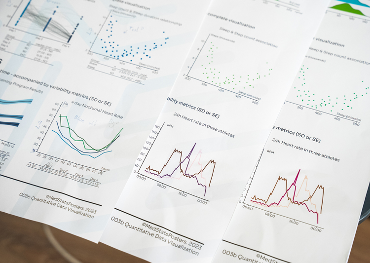
To say data visualization in quantitative research is important would be an understatement - the only way to "see" the distribution of data is to plot it, and only then can we understand how to subsequently analyze it.
I worked on this set of posters right after the qualitative research set. It made the process a lot easier when it comes to proportions and size, especially with displaying study designs and research flow.
But I needed a new skill to complete it - use of R. This was a harsh realization, but it was time to start using R as the default tool for statistical analysis and visualization. So, all charts on the latter poster are R outputs.
Over time, I became aware of the same challenge as with qualitative data - finding the right chart or graph. But there's one additional detail - visual display of quantitative data must be accompanied by a table.
These were, by far, the hardest posters to make, but they taught me an important lesson - we know medical statistics only to the extent we're able to apply what we know. Otherwise, we're just theorists.
So it makes sense that these two posters are here to remind you of the differences in study designs, but also how important it is to see your data - for which you do need technical skills.
It all starts with clearly defining your hypothesis, the design that will allow you to adequately test it, and the results you will generate and appropriately visualize to support your conclusions.
